Project Title
Dominion Mobile App
Overview
The time section of the app needs to be updated to include a better overview of the employee's schedule and allow edits to punches.
My Role
Research and Design
Initial Research
The functionality we wanted to add to the app included allowing users to:
-
Request to add a missing punch
-
See their schedule along with any actual punches
-
See more than one week of information at a time
-
See their punches on a punch map (ties in with geofencing feature)
Most of that functionality already existed on the desktop site, so a lot of my research was looking into how we currently handled those features. It was important to understand how they worked as a baseline since I'd need to take those patterns and modify them to work in a mobile environment.
I also looked for examples from other apps that utilized scheduling and tracking like other time clock apps, finance apps, and productivity apps. Some of the designs and workflows I found inspiring can be seen below.

Ways to display dates, punches in, and punches out in a small space

Listing basic info then showing more details when selected

Full calendar with important dates highlighted and color coded
Sketching
Adding features to an existing page was nice because I had a starting point to work off of, but also a bit restrictive since I knew we couldn't stray too far from what we'd already made. The two strongest directions I came up with both left the top half of the page alone but reworked the scheduling portion and added punch editing in.

Option 1
-
Schedule tab between week and month views
-
Week view shows entire week's info
-
Month view shows color coded calendar
-
Both show more details per day when selected as drawer with punch map

Option 2
-
Weekly schedule tied to hours graph card
-
Entire week's info shows on screen as clickable cards
-
Details for selected day show on new screen with punch map
After showing these options to some team members I learned that while the month view would be nice to have, clients didn't always update schedules that far in advance. We would either need to find a way to indicate the end of the current schedule or scrap the calendar idea. That hurdle combined with the overall workflow of option 2 better aligning with other workflows in the app, it was decided to move forward with that idea.
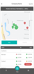
The biggest challenge in terms of design was how to tie punches from the card to the punches on the map. There were existing elements from the app that could be referenced for requesting a punch and card layout, but connecting two points of data was a new pattern.


V1
Not enough separation between dates, map looks too cluttered.
V2
Clear separation of dates but card looks busy, highlighting only selected punch is a better solution.
V3
Cleaned up info presentation and swipe to see other dates reduces visual clutter.
Final Designs

1
2

3
5
4

6
-
Users can swipe between weeks to see their schedule. Only weeks that have not been accepted by payroll and have a schedule show.
-
Cards for each day of the week shows the employee's schedule, hours scheduled and worked, and if there is a missing punch or exception for that day there's an icon to let the user know.
-
Tapping a card in the schedule brings the user to the punch detail view with that date's information displayed. Users can swipe between dates.
-
The date card shows all punches for the day. Any punch with an exception gets an icon and a snackbar message will pop up detailing the exception. If a user taps a punch, it gets highlighted.
-
The highlighted punch expands on the map for the user to see. Punches within the geofence range are green with a checkmark, punches outside are red with an exclamation mark.
-
Users requesting a missing punch will get the same type of drawer as seen in the time off section of the app but with punch information.
Reflections
I don't work on mobile very often so this project allowed me to learn more about what makes a successful mobile design. Looking back, some of the areas users can tap could probably get bigger or have more space between them to reduce error but the workflow of this project fit the requirements well.